Showing posts with label Wedding. Show all posts

Monday, July 2, 2012

Emma + Ben

We were ecstatic to be asked to design romantic wedding invitations for the union of Emma Forrest and Ben Mendelsohn. Ben is an actor hailing from Australia (with an insanely long filmography to his name), and Emma is a writer I've always adored. If you haven't read her riotously personal and beautiful memoir, Your Voice in My Head, it's a perfect Summer read. They were married at the fabled Chateau Marmont, a location dear to Emma's heart, as it is essentially a neighborhood clubhouse/home-away-from-home for the couple, and was also featured in her first novel, Namedropper (released in 2000), which is what first made me fall for her word wizardry. So when Emma asked us to create something unconventional yet still full of classic old Hollywood romance, we were over the moon! 


Taking inspirational cues from the Chateau's storybook architecture, Film Noir, and a book the couple so sweetly sent us about the nuptials of classic Hollywood stars, we first designed a save-the-date featuring a 1940s photo of Bogie and Bacall that Emma & Ben adore. We playfully mixed the iconic Martinique banana leaf wallpaper pattern from the Beverly Hills Hotel, with a custom crest imbued by the Chateau's heraldic-style neon sign, to create a feeling rooted in Los Angeles folklore.

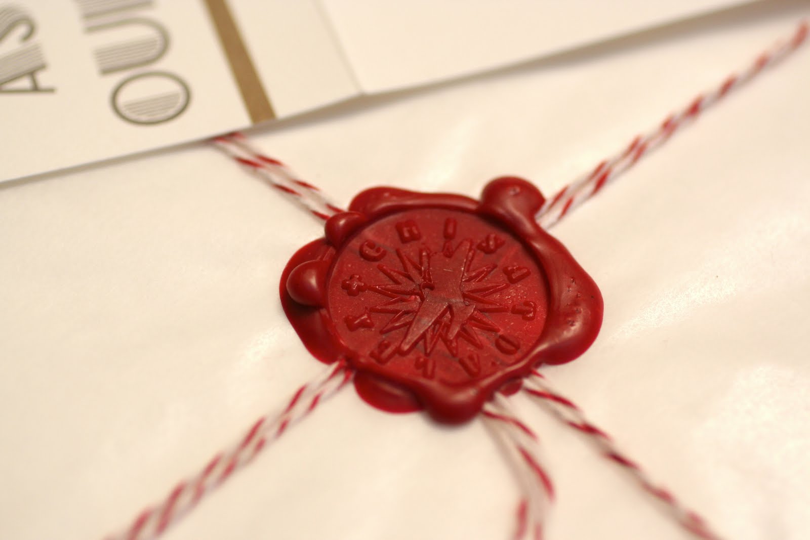
Being that both Emma & Ben are soundtrack obsessed, they also wanted us to instill a rock 'n roll vibe into the piece, so we designed the invitation as a broadside, inspired by '70s Rolling Stones tour posters, so each invitation would feel like a frame-able work of art when pulled out of the industrial mailers that guests received. By an act of kismet, my sister, Lizzie Brandt, emailed us a beautiful photo she had recently taken of swaying Santa Monica palm trees, which became the background image in silhouette, silk-screened on creamy sepia-toned cotton paper from France, in metallic gold by Brooklyn's Haven Press, along with the '40s Technicolor-inspired custom burgundy and sea-foam green shades we had chosen for the vintage customized type and crest designs.

At the bottom of the invite, we added two custom Art Deco monograms, as well as the RSVP date in roman numerals; each gesture inspired by the opening credits of classic films (see an example from the 1939 Claudette Colbert film, Midnight, below).

We're ecstatic to have taken part in the joining of two creative and passionate souls, who will endlessly inspire each other, and for eons longer than Bogie & Bacall had the chance to. Mazel Tov, you two!

Friday, May 4, 2012

Colby + Anna.


We're elated to see that Martha Stewart Weddings has lovingly featured the Santa Monica, California nuptials of our clients and friends, Anna + Colby (view the entire gorgeous gallery here). We had an especially inspired time designing the couple’s elaborate invitation suite, as well as the custom typography, as their desired look was dear to our hearts . . . a boho-mid-century mix of Native American symbology, early-California craft, indigo textiles, Scandinavian design and vintage Ralph Lauren vibes. Another aesthetic muse for the project was Anna’s parents’ historically-preserved Craftsman home, where the reception took place. 
Each completely custom invitation featured: a 3-page booklet letterpressed on soft cotton paper and hand-bound with hemp twine using an old Japanese technique, a map of Santa Monica, and a laser-cut RSVP card in a floral shape featured throughout the design. Each bundle was wrapped in a metallic gold kraft paper obi and hemp jute, then sent to guests in a kraft paper envelope with a letterpressed flap and screen-printed floral pattern. The final touch was a custom-designed stamp featuring Anna + Colby's '70s surf-inspired monogram.
After their vows were exchanged overlooking the Pacific in scenic Hotchkiss Park, the wedding party paraded though the grass, singing, waving flags, blowing bubbles and shaking tambourines, on the journey to the reception banquet, where the beautiful table settings included laser-cut and letterpressed place cards. 
The event's wedding planners, Bash, Please, creatively applied the custom monogram and typography we designed . . . for banners, menus, escort cards, embroidered table numbers, and a chuppah, all of which are featured in the Weddings story. We also outfitted the duo with letterpressed “Thank You” cards that they can use forever & ever. 

Tuesday, April 3, 2012

Memphis Matrimony.


In 1981, designer Ettore Sottsass formed an Italian design and architecture collaborative called the Memphis Group, named in homage to the Bob Dylan song Stuck Inside of Mobile with the Memphis Blues Again, which had been playing on repeat during the group's first meeting. Memphis-Milano produced and exhibited furniture, fashion and design objects through 1988. Their influential work drew inspiration from Art Deco, Pop Art, and '50s kitsch, essentially defining the colorful and cartoonishly futuristic '80s aesthetic.
Above: Some of our major Memphis inspirations for the project (from L to R), Michele De Lucchi's Oceanic Lamp (1981), Thomas Bley's Astor lamp (1982), the Tahiti lamp by Ettore Sottsass (1981), and Sottsass's iconic Carlton room divider (1981).
Being that we're pretty much obsessed with the Memphis aesthetic, we were over the moon when asked by clients, Morgan & John, if we could rise to the challenge of designing a perfectly Memphis-style wedding suite, to which we replied "are you kidding?" We were officially in design-nerd heaven, floating on a pastel turquoise triangular cloud.Morgan wanted the invites to echo her mother's adoration of Memphis, which is displayed in the decor of her parents circa-1980s weekend home on Long Island, where the couple's nuptials would take place. We made sure that the invitation emanated the minimal-yet-meaningful simplicity that the Memphis school, as well as her parents beloved beach abode, were all about.Our construction began with neon bright white 100% cotton rag paper, which we then flood-coated with deeply saturated colors using offset lithography. Each of the pieces was then die-cut and scored to create dimension. We completed the suite with letterpressed confetti-esque patterns on several surfaces, each of which were custom designed, the exception being Sottsass' classic 1978 Bacterio pattern, which we placed as a broad panel to separate the text on the main invitation piece.
We're now certain that if Memphis-Milano were ever to re-form, there'd be two seats booked on the next Alitalia flight . . . our suitcases full of plastic tubing, pink acrylic, and black & white striped vinyl.

Saturday, November 12, 2011

Tracy + Stephen, Part Two: Electric Boogaloo.

Our friends, Stephen & Tracy, are so in love that they needed two ceremonies to fully celebrate their cosmic connection . . . one on the beach in Malibu, California (previously mused about here), and one for close family on Stephen’s beloved aunt & uncle’s farm in Indiana.
Based on their wish to have an old-time romantic look for the ceremony, and the fact that they were wed in a cozy rural setting, we designed an invitation inspired by antique ephemeral pamphlets found in country general stores. All our design cues stemmed from turn-of-the-century Farmer's Almanacs, so we utilized typefaces and decorative elements found in our collection of Victorian books.
The 6-page custom-designed invitations were printed on soft vanilla-colored paper, with the cover a thicker weight paperstock, and each booklet was bound with a linen string. For the RSVP card, we perforated the back page of the book to make a detachable postcard that could be sent back to the bride & groom.
For the save the dates, we designed and letterpressed postcards inspired by antique flower-seed packets, each printed in chocolate brown ink on recycled kraft paper.

Wedding portrait: Courtney Brooke

Tuesday, October 11, 2011

Love in Bloom.

For lovely newlyweds and childhood sweethearts, Heather & Alex, we created a chic custom-designed black-and-white letterpressed invitation suite, as classically elegant as the couple themselves. Heather writes for the Huffington Post as well as her own lifestyle blog, LA In Bloom, and Alex is a social media consultant, but together they own the Los Angeles art gallery, Taylor De Cordoba. Inspired and inspiring, their lives are full of dreamy West Coast road trips, a posse of talented friends, and creative homemade meals in their boho garden. Given their cozy lifestyle, we wanted to infuse the design with subtle style cues taken from the things they love . . . rustic California architecture, the beauty of Mexican florals, mid-century pottery, hiking in Ojai, handcrafted art, and the exquisiteness of fine food.
We designed six pieces for the suite, including; a hand-lettepressed postcard save-the-date, folded invitation tied with black silk-satin ribbon, RSVP postcard, place-cards signed in hand-calligraphy (by yours truly), table numbers, and menus.
Special attention was paid to the creation of the letters used in their monogram, along with each digit of their table numbers, as we custom illustrated each specimen using fragments of a vintage floral pattern found in a book on rare antique wood typography.
Congrats, lovelies!

Photo: Photo of Taylor & De Cordoba by Nancy Neil for Martha Stewart Weddings

Thursday, June 9, 2011

Voyage d'amour.

For the Autumn marriage of Chisato & Alex, a lovely, jet-setting Manhattan-based duo, we created a seven-piece invitation suite inspired by their love of travel, Machine Age design, and antique paper ephemera.

The invitation elements were housed in hand-made boxes inspired by antique cigar packaging and vintage valises. Each box was covered in recycled butcher-paper, hot-stamped in metallic silver foil with the date and location of their nuptials, then sealed closed with an Art Deco luggage label-inspired sticker.

We wanted each guest to feel as if they were opening a luxe steamer trunk, custom packed for their magical one-night voyage . . . filled with precious accoutrement, each piece crafted of a different paper or fabric, for a uniquely tactile experience.Inside each box, guests received;

~ A folded invitation printed in silver and gold metallic inks, held in a glassine envelope tied with striped baker's twine, and stamped with a custom-made wax seal featuring a '30s jetliner and the couples names.

~ RSVP postcard inspired by vintage Par Avion envelopes, letterpressed, and die-cut into the shape of a luggage tag.

~ Letterpressed envelope holding several blank pages of vintage stationery, for each guest to cover in an art piece and/or memory they'd like to share with the couple, which we will later group together to be hand-bound into a custom guestbook.

~ New York City souvenir postcard, featuring a gorgeous scenic watercolor on the front, painted by genius NY-based artist, Christopher Young, along with letterpressed vintage typography in gold ink on the back.

~ Cotton handkerchief silkscreened with a custom-designed map to the wedding location (The Foundry, Long Island City, NY), also designed by Christopher Young (photos to be included shortly).

Invites were sent to guests in a recycled-paper-padded envelope, hand-stamped with the couples return address.
This elaborate suite was one of the most inspiring projects we've created thus far, aided by clients as enthusiastic and open-minded as Chisato + Alex. They dared us to go overboard, and we always adore a good challenge. We wish them bon voyage on the endless sea of love.

Sunday, May 15, 2011

Forest Fairy Tale.

For lovely couple, Francesca and Iain, who are having a whimsical forest ceremony in Cardigan, Wales, we created an entirely hand-drawn invitation, inspired by romantic turn-of-the-century correspondence cards, and Magritte's clouds, for a blend of sweetness and surrealism. It also marked the first time we got to write "kilts welcome" on anything, which was a thrill. Both the invite and envelope were letterpressed in vibrant pink and metallic bronze on Reich Savoy paper.

Thursday, October 14, 2010

Candy Darling.

We're simply over the moon about a recent mention in Daily Candy's Fall 2010 Wedding Guide, and wanted to share the good news! We are featured as the current go-to designers for dazzling custom event invitations, bespoke bookbinding and letterpress wizardry.

And if you happen to be on Facebook (who isn't?), we'd be jazzed to have you as a member of our Thunderwing group, so come on over!

* Special thanks to the magical Candy ladies, Crystal and Heather, for granting a big wish : )

Monday, October 11, 2010

Heather & Alec, Pt. Deux.

Our lovely friends, Heather & Alec, have held two beautiful ceremonies for their nuptials . . . one musical soirée in L.A. (previously mused about here), and a more spiritual gathering in the misty woods of Big Sur, California (see the digital save-the-date below).

For their earthy invitation suite, we had individual kraft-paper boxes created (in collaboration with West Dixon of ColorWest Packaging), to house the various ephemeral elements, each item specifically inspired by the majestic Big Sur landscape and its new age, beat poem-lauded history. On the top of each box we affixed a textural label hand-letterpressed with the wedding info, in a very 1970s inspired typeface.
Included in each box were small custom-designed books of flecked recycled paper hand-bound in jute, telling the story of their union through nature-inspired illustrations found in a vintage hiking handbook. We also penned a cosmically romantic tale about the couple's evolution to accompany the art. Also included in the boxes were; custom-designed maps of the wedding locations, RSVP cards letterpressed on textural sand-like stock, along with kraft envelopes. The contents of each box was then topped with a beautiful bird feather hand-chosen by the bride.

Wedding portrait: Lizzie Brandt Invitations: Thunderwing Press

Wednesday, September 15, 2010

L.A. Story

For the Los Angeles wedding celebration of two very dear friends, Heather & Alec, we designed a whimsical ornamentation, inspired by haute Art Deco nightclubs and disco-filled jukeboxes. Each invitation was letterpressed in three colors . . . violet, grey and metallic copper, on rich chocolate brown paper. Incorporated in the design are both a music note and a heart, in homage to their band, The Heartstring Symphony (whose logo we also proudly produced), not to mention that music is what initially brought them together, and will always be a part of their love, forever (click image to view full-size) . . .
Congrats to Thunderwing's favorite songbirds!

Top Photo: Jesse Dixon

Thursday, September 9, 2010

Tracy + Stephen.

For the California beach wedding of two rock 'n roll souls, we took inspiration from West Coast psychedelic posters of the 1960s, classic Art Nouveau, ancient mysticism, then topped it off with some interplanetary love vibes. Tracy & Stephen are a very cosmic coupling, so we knew a basic invite just wouldn't suit, so we had their invites screenprinted poster-size on giant sheets of natural kraft paper, then folded down into matching recycled kraft envelopes. For addressing purposes, we had custom rubber stamps created (accompanied by purple ink to match the posters), featuring a magical bearded flying merman, who was featured on the poster as well. Click images to view in full detail:

Top portrait: Courtesy of Tracy Conti-McCarty. Invitation photos: Thunderwing Press